Landmark Group
Employee communication can be monotonous and boring; WHEN we aren't designing them. Landmark group, a multinational conglomerate that houses over 50 lifestyle and consumer brands, came to us to step up their internal communication. And, step it up we did.
- Typography Used
-
Raleway x Weights
Primary font
- Colors Used
Here's How
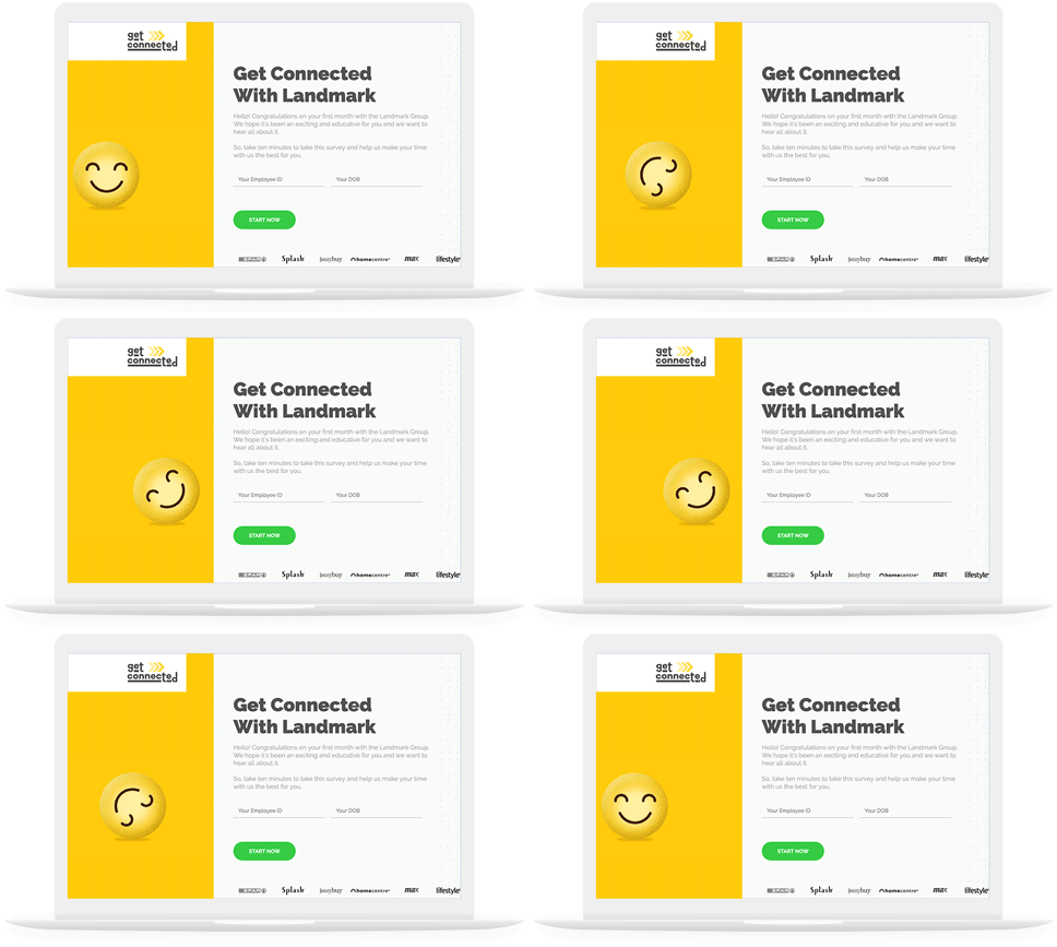
Get Connected
A 3-page long Q&A is the last thing that could help an employer get connected with their employees. We transformed Landmark Group's new-employee survey to an interactive online survey that made sure employees got connected and stayed connected until the last question.
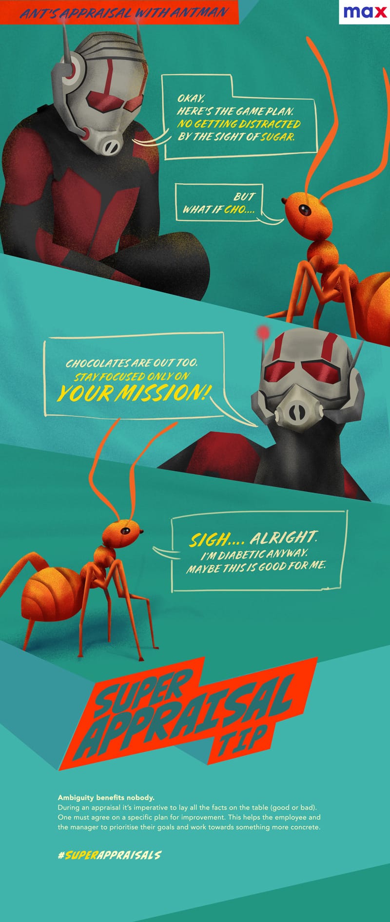
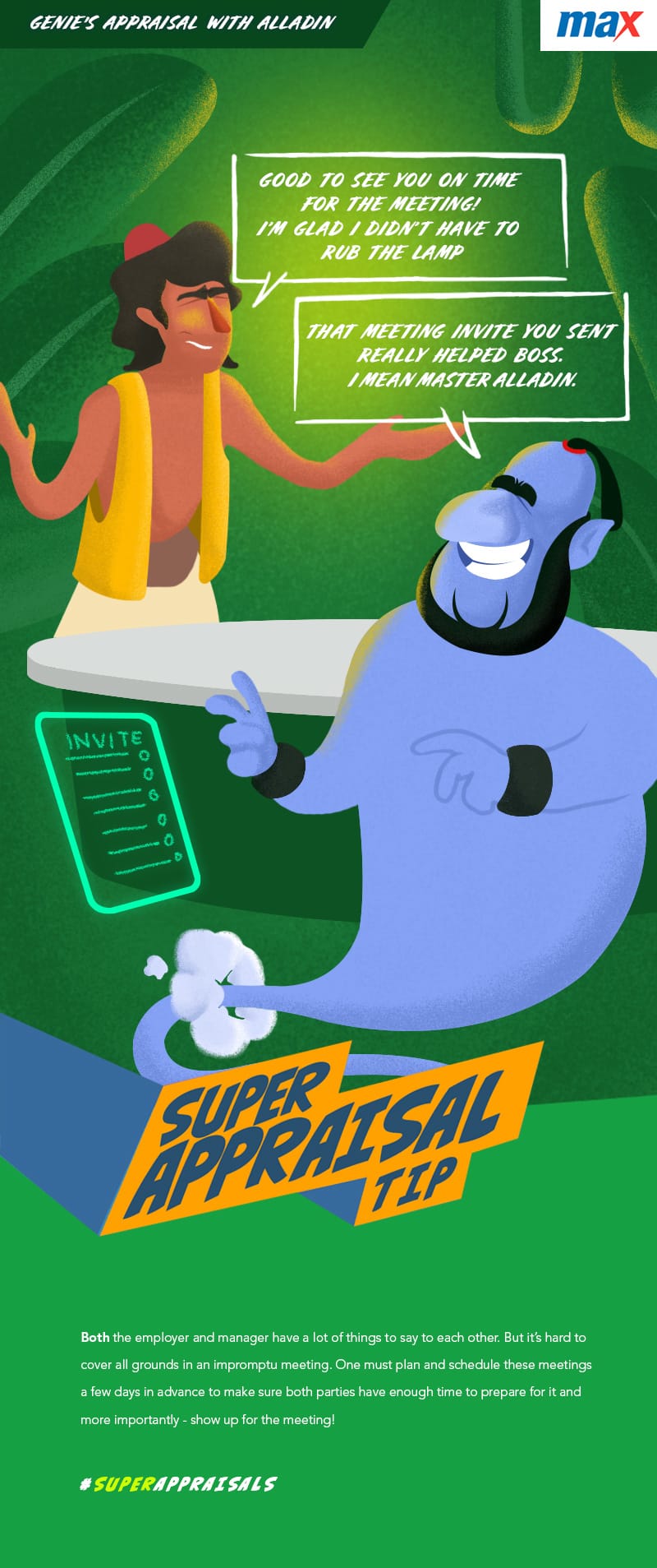
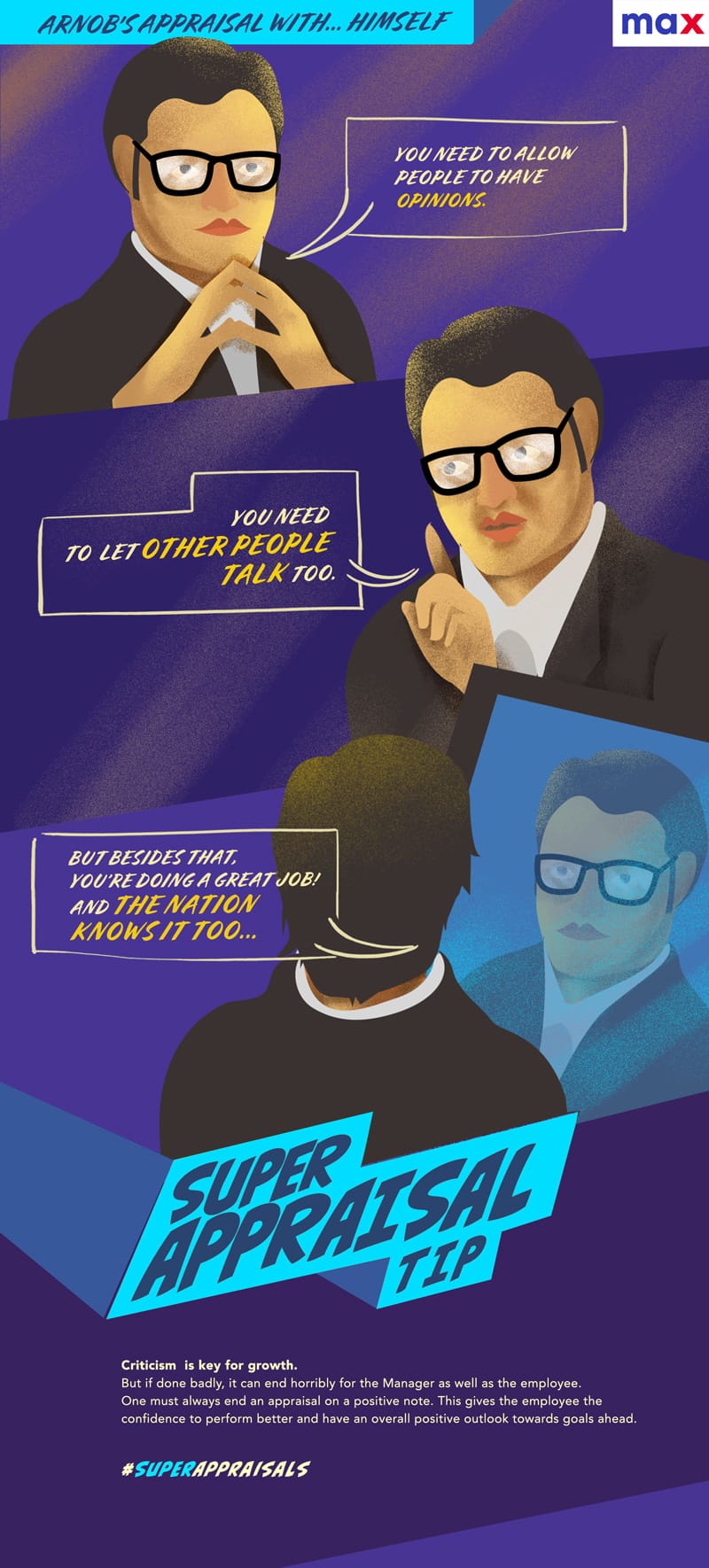
Check it outMax's Super Appraisal
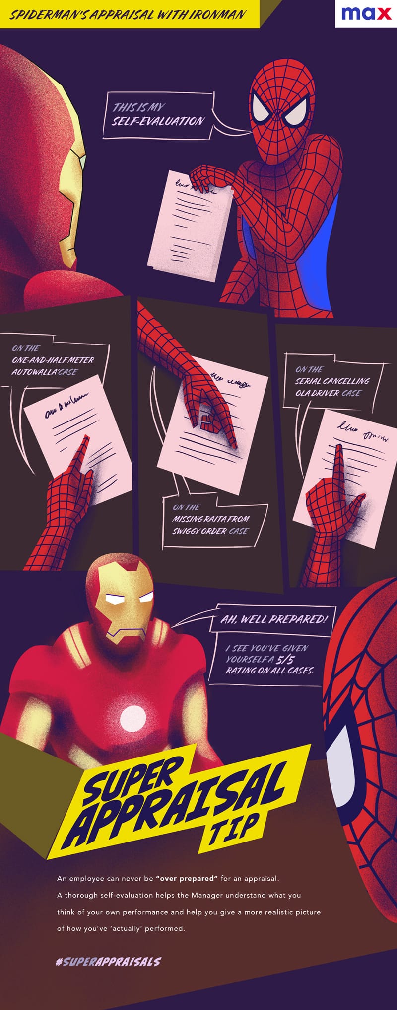
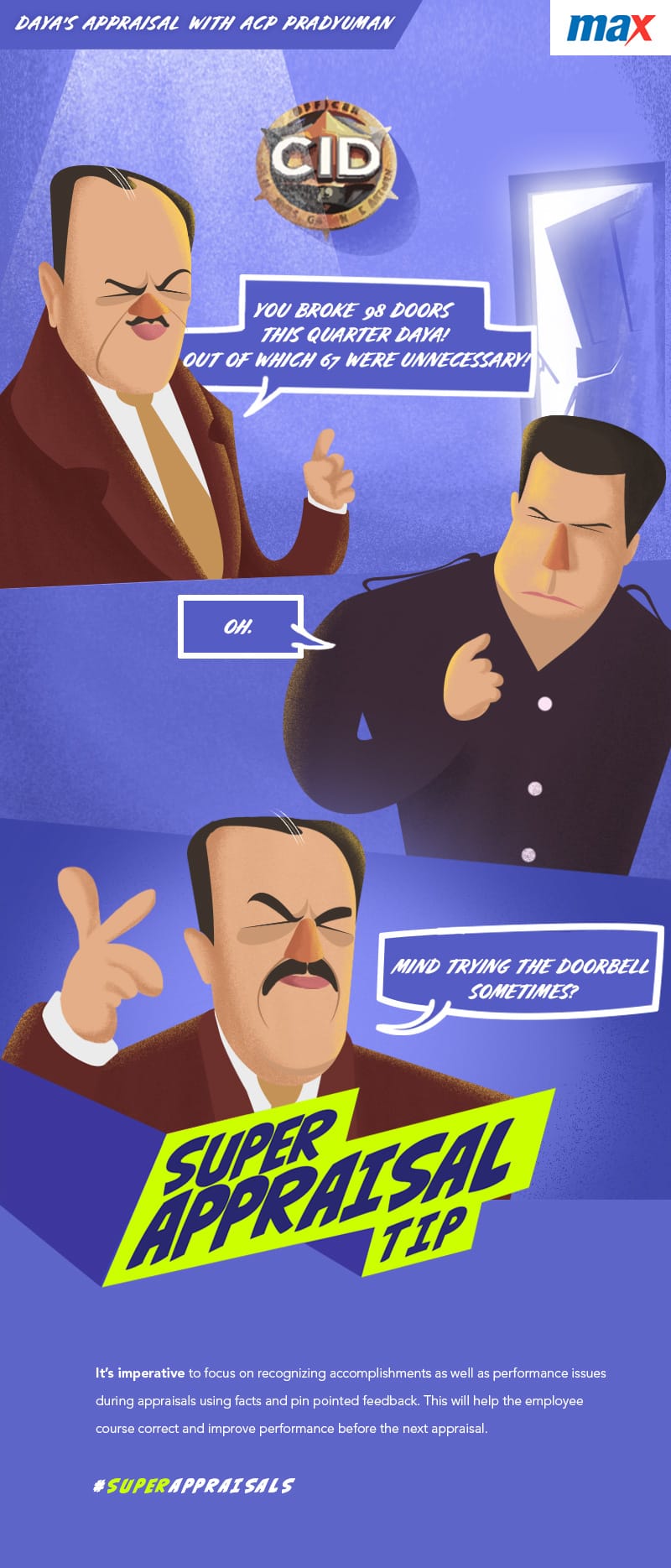
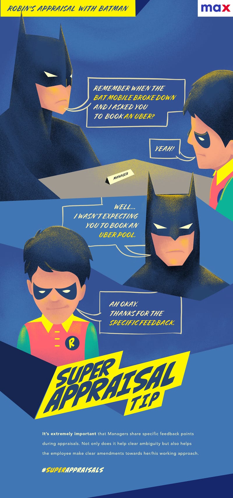
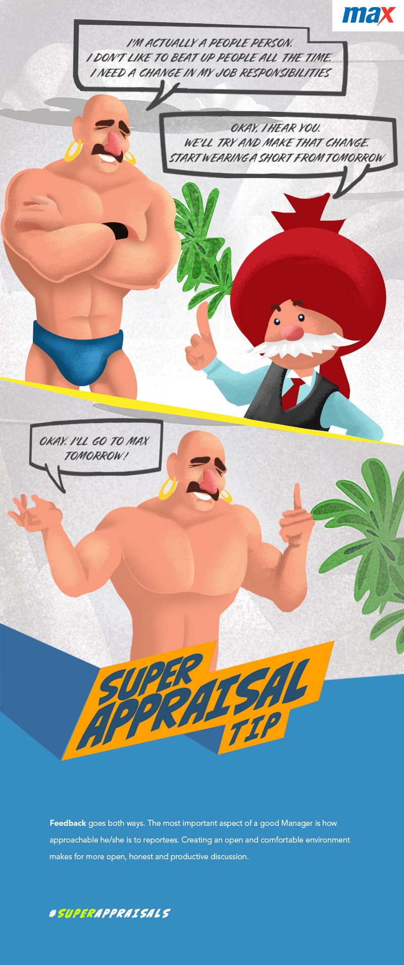
Think appraisal communications are boring? Think again. When you have Arnab & Arnab (you read it right) or Iron Man & Spiderman or your favourite ACP & Daya giving you tips to prepare for the appraisal season, it's anything but boring.


